components
All components are styled with tailwindcss and built to easily be edited to fit your projects needs.
AdminBody
Used to apply padding to match with the AdminHeader Component.
Importing AdminBody
import AdminBody from "components/AdminBody/AdminBody";
Using AdminBody
<AdminBody>
  //
  // Slot
  //
</AdminBody>
AdminFooter
Used as a mobile footer navigation. Nest it within the AdminMain component for proper spacing, and use the BtnMobileMenu component for matching prestyled buttons.
Importing AdminFooter
import AdminFooter from "components/AdminFooter/AdminFooter";
Using AdminFooter
<AdminFooter>
  //
  // Slot
  //
</AdminFooter>
AdminFooterProps
hidden: boolean optional
Hide the toggle menu button
Demo

AdminForm
A form component.
Importing AdminForm
import AdminForm from "components/AdminForm/AdminForm";
Using AdminForm
<AdminForm submit={submitFunction}>
  //
  // Slot
  //
</AdminForm>
AdminFormProps
onSubmit: function required
The form submit action
AdminHeader
Used as a header within AdminMain and shares common padding with AdminBody. Other related components are AdminHeaderBtnWrap, AdminHeaderTitle, and AdminHeaderSubtitle.
Importing AdminHeader
import AdminHeader from "components/AdminHeader/AdminHeader";
Using AdminHeader
<AdminHeader
   v-slots={{btns: () => <ExampleComponent />}} // Used for the button slot
>
  //
  // Default slot
  //
</AdminHeader>
Demo

AdminHeaderBtnWrap
Used to wrap the Btn component within AdminHeader (or any variation of Btn, such as BtnSmall).
Importing AdminHeaderBtnWrap
import AdminHeaderBtnWrap from "components/AdminHeaderBtnWrap/AdminHeaderBtnWrap";
Using AdminHeaderBtnWrap
<AdminHeaderBtnWrap>
  //
  // Slot
  //
</AdminHeaderBtnWrap>
AdminHeaderBtnWrapProps
hidden: boolean optional
Hide this button on mobile
AdminHeaderSubtitle
Used as a prestyle AdminHeader subtitle.
Importing AdminHeaderSubtitle
import AdminHeaderSubtitle from "components/AdminHeaderSubtitle/AdminHeaderSubtitle";
Using AdminHeaderSubtitle
<AdminHeaderSubtitle>
  Subtitle Label
</AdminHeaderSubtitle>
AdminHeaderTitle
Used as a prestyle AdminHeader title.
Importing AdminHeaderTitle
import AdminHeaderTitle from "components/AdminHeaderTitle/AdminHeaderTitle";
Using AdminHeaderTitle
<AdminHeaderTitle>
  Title Label
</AdminHeaderTitle>
AdminMain
Used to nest AdminFooter with appropriate spacing for mobile.
Importing AdminMain
import AdminMain from "components/AdminMain/AdminMain";
Using AdminMain
<AdminMain>
  //
  // Slot
  //
</AdminMain>
AdminShell
Used as a wrapper component within your App.tsx file to apply proper layout styling. It's direct children components are AdminSidebar and AdminMain.
Importing AdminShell
import AdminShell from "components/AdminShell/AdminShell";
Using AdminShell
<AdminShell>
  //
  // Slot
  //
</AdminShell>
AdminSidebar
Used as the admin navigation sidebar.
Importing AdminSidebar
import AdminSidebar from "components/AdminSidebar/AdminSidebar";
Using AdminSidebar
<AdminSidebar>
  //
  // Slot
  //
</AdminSidebar>
Btn
An unstyled link (or button) component with props to be used as a base for other link components. It can also be used within your project if you want to apply custom styling to an individual link.
Depending on which props you use, this component will either be an <a>, a <router-link>, or a <button> element.
Importing Btn
import Btn from "components/Btn/Btn";
Using Btn
<Btn
  icon={faArrowRight}
  label="Add New"
  reverse={true}
  to={{name: routeNames.edit}}
>
  //
  // Slot
  //
</Btn>
BtnProps
click: function Optional
Passing down a click function will make this component a <button> element
disabled: Boolean Optional
Makes it non-clickable and opaque
icon: FontAwesomeIcon Object Optional
A FontAwesomeIcon icon
id: String Optional
Component Id
label: String Optional
The component text field
reverse: Boolean Optional
Reverse the order or the icon and label
to: RouteLocationRaw Optional
Passing down a route will make this component a <router-link> element
toExternal: String Optional
Passing down an external link will make this an <a> element that opens a new tab
type: String Optional
Type applies to a <button> element when using the click prop
We've created multiple prestyled Btn components to speed up the development process. They all share props with the Btn Component, although some only utilize a few.
BtnIcon
A lighter version of the Btn component that displays only an icon.
Importing BtnIcon
import BtnIcon from "components/Btn/BtnIcon";
Demo

BtnLogin
A button that is styled for the login route.
Importing BtnLogin
import BtnLogin from "components/Btn/BtnLogin";
Demo

BtnIconMobileMenu
An icon only button that is styled like the menu toggle button in the Menu component.
Importing BtnIconMobileMenu
import BtnIconMobileMenu from "components/Btn/BtnIconMobileMenu";
Demo

BtnMobileMenu
A button that is styled to match the menu toggle button in the Menu component.
Importing BtnMobileMenu
import BtnMobileMenu from "components/Btn/BtnMobileMenu";
Demo
BtnPrimary
A styled button to be used as the primary button.
Importing BtnPrimary
import BtnPrimary from "components/Btn/BtnPrimary";
Demo

BtnSecondary
A styled button to be used as the secondary button, in contrast with the primary button.
Importing BtnSecondary
import BtnSecondary from "components/Btn/BtnSecondary";
Demo

BtnSmall
A smaller version of Btn.
Importing BtnSmall
import BtnSmall from "components/Btn/BtnSmall";
BtnSmallPrimary
A smaller version of BtnPrimary.
Importing BtnSmallPrimary
import BtnSmallPrimary from "components/Btn/BtnSmallPrimary";
Demo

BtnSmallSecondary
A smaller version of BtnSecondary.
Importing BtnSmallSecondary
import BtnSmallSecondary from "components/Btn/BtnSmallSecondary";
Demo

BtnSubmit
A submit button to be used with forms.
Importing BtnSubmit
import BtnSubmit from "components/Btn/BtnSubmit";
Demo

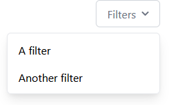
Dropdown
A dropdown component.
Importing Dropdown
import Dropdown from "components/Dropdown/Dropdown";
Using Dropdown
<Dropdown>
  //
  // Slot
  //
</Dropdown>
Demo
FieldCheckbox
A checkbox component used for forms.
Importing FieldCheckbox
import FieldCheckbox from "components/FieldCheckbox/FieldCheckbox";
Using FieldCheckbox
<FieldCheckbox
  label="Teams"
  name="teams"
  options=[
    {label: "Red", value: "red"},
    {label: "Blue", value: "blue"}
  ]
  val={'red'}
/>
FieldCheckboxProps
label: String Optional
Checkbox label
name: String Required
Checkbox name
options: FieldCheckboxOptionProps Array Required
Checkbox options
unstyled: Boolean Optional
Removes component styling
FieldCheckboxOptionProps
label: String Required
Option label
value: Any Required
Option value
Demo

FieldError
A styled error message for form fields.
Importing FieldError
import FieldError from "components/FieldError/FieldError";
Using FieldError
<FieldError>
  //
  // Slot
  //
</FieldError>
Demo

FieldInput
A styled input component used for forms.
Importing FieldInput
import FieldInput from "components/FieldInput/FieldInput";
Using FieldInput
<FieldInput
  label="Email Address"
  name="email"
  type="email"
/>
FieldInputProps
label: String Optional
Input label
name: String Required
Input name
type: String Default: "text" Optional
Input type
unstyled: Boolean Optional
Removes component styling
Demo

FieldLabel
A label component meant to compliment form fields.
Importing FieldLabel
import FieldLabel from "components/FieldLabel/FieldLabel";
Using FieldLabel
<FieldLabel>
  //
  // Slot
  //
</FieldLabel>
Demo

FieldRadio
A styled radio component for forms.
Importing FieldRadio
import FieldRadio from "components/FieldRadio/FieldRadio";
Using FieldRadio
<FieldRadio
  label="Teams"
  name="teams"
  options=[
    {label: "Red", value: "red"},
    {label: "Blue", value: "blue"}
  ]
  val={'red'}
/>
FieldRadioProps
label: String Optional
Radio label
name: String Required
Radio name
options: FieldRadioOptionProps Array Required
Radio options
unstyled: Boolean Optional
Removes component styling
FieldRadioOptionProps
label: String Required
Option label
value: Any Required
Option value
Demo

FieldSelect
A styled select component for forms.
Importing FieldSelect
import FieldSelect from "components/FieldSelect/FieldSelect";
Using FieldSelect
<FieldSelect
  label="Experience"
  name="experience"
>
  <select value="1">1 Year</select>
  <select value="2 to 4">2 - 4 Years</select>
  <select value="5+">5 Years +</select>
</FieldSelect>
FieldSelectProps
label: String Optional
Select label
name: String Required
Select name
unstyled: Boolean Optional
Removes component styling
Demo

FieldTextarea
A styled textarea component for forms.
Importing FieldTextarea
import FieldTextarea from "components/FieldTextarea/FieldTextarea";
Using FieldTextarea
<FieldTextarea
  label="Comments"
  name="comments"
/>
FieldTextareaProps
label: String Optional
Textarea label
name: String Required
Textarea name
unstyled: Boolean Optional
Removes component styling
Demo

LoginError
A failed message component.
Importing LoginError
import LoginError from "components/LoginError/LoginError";
Using LoginError
<LoginError />
Menu
A menu component for mobile and tablet screen sizes.
The route for the menu page works by default, as does the back button.
Importing Menu
import Menu from "components/Menu/Menu";
Using
<Menu>
  //
  // Slot
  //
</Menu>
ModelTable
A table component for your records.
Importing ModelTable
import ModelTable from "components/ModelTable/ModelTable";
Using ModelTable
<ModelTable {...ModelTableProps} />
ModelTableProp
checkboxClick: Function Optional
Action when the row checkbox is clicked
columnOrder: Array Optional
Column order for each row
excludeTimestamps: Boolean Optional
Excludes timestamps
headingLabels: HeadingLabel Array Optional
An array of labels to be used as column titles
rows: ModelRow Array Optional
An array of records
ModelRowProps
id: String | null Required
The record Id
description: String | null Optional
The record description
icon: String | null Optional
A record icon field
image: String | null Optional
A record image
insertedAt: String | null Optional
The time the record was created at
subtitle: String | null Optional
The record subtitle
title: String | null Optional
The record title
updatedAt: String | null Optional
The time the record was last updated at
HeadingLabelProps
key: String Required
The column title key
label: String Required
The column title label
Pagination
A sticky pagination component for model pages.
Importing Pagination
import Pagination from "components/Pagination/Pagination";
Using Pagination
<Pagination
  count={data...}
  countBefore={data...}
  goToFirst={goToFirst}
  goToLast={goToLast}
  limit={100}
  next={next}
  prev={prev}
/>
PaginationProps
count: Number Required
The amount of records you currently have loaded
countBefore: Number Required
The amount of records prior to loading the current record set
goToFirst: Function Required
Go to the first page of the records
goToLast: Function Required
Go to the last page of the records
limit: Number Required
How many records are shown per page
next: Function Required
Go to the next page of records
prev: Function Required
Go to the previous page of records
Demo

Pill
An active filter pill component.
Importing Pill
import Pill from "components/Pill/Pill";
Using Pill
<Pill
  icon={faTag}
  label="To do"
  remove={() => {}}
>
  //
  // Slot
  //
</Pill>
PillProps
icon: FontAwesomeIcon Object Optional
A FontAwesomeIcon icon
iconColor: String Optional
A custom icon color that is passed to a style tag
label: String Optional
The component text field
remove: Function Optional
A function that actives the X icon, and removes the pill components
Demo

Search
A search bar component.
Importing Search
import Search from "components/Search/Search";
Using Search
<Search
  change={() => {}}
  focusOnMount={false}
  placeholder="Search..."
  val={''}
/>
SearchProps
change: Function Required
The action that happens when a search value is input
focusOnMount: Boolean Required
Focuses the search input on page load
placeholder: String Optional
Search bar placeholder text
val: Function Required
Default search value
Demo

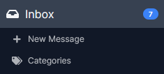
SidebarNavItem
A navigation item component. We use this by default in our themes in the AdminSidebar and Menu components. The component can be rendered as a <button> or a <router-link> depending on the props passed to it.
Importing SidebarNavItem
import SidebarNavItem from "components/SidebarNavItem/SidebarNavItem";
Using SidebarNavItem
<SidebarNavItem>
  //
  // Slot
  //
</SidebarNavItem>
SidebarNavItemProps
click: Function Optional
The action that happens on click, and this makes the component a <button>
icon: FontAwesomeIcon Object Optional
A FontAwesomeIcon icon
id: String Optional
The component Id
isChild: Boolean Optional
Styles the component as a sub-nav item
label: String Optional
The component text field
notification: Number Optional
An option to pass down notifications
to: RouteLocationRaw Optional
The route the component should link to, and this makes the component a <router-link>
Demo
StateEmpty
An empty state component, to be paired with the ModelTable component when there are no search results. If no props are passed down, the component will use it's default icon and label.
Importing StateEmpty
import StateEmpty from "components/StateEmpty/StateEmpty";
Using StateEmpty
<StateEmpty />
icon: FontAwesomeIcon Object Optional
A FontAwesomeIcon icon
label: String Optional
The component text field
Demo

StateLoading
An animated loading component.
Importing StateLoading
import StateLoading from "components/StateLoading/StateLoading";
Using StateLoading
<StateLoading />
Demo

Wrapper
A wrapper component for consistent horizontal padding.
Importing Wrapper
import Wrapper from "components/Wrapper/Wrapper";
Using Wrapper
<Wrapper>
  //
  // Slot
  //
</Wrapper>